Loomi
Mersal translated Loomi's core values into a comprehensive visual identity system:
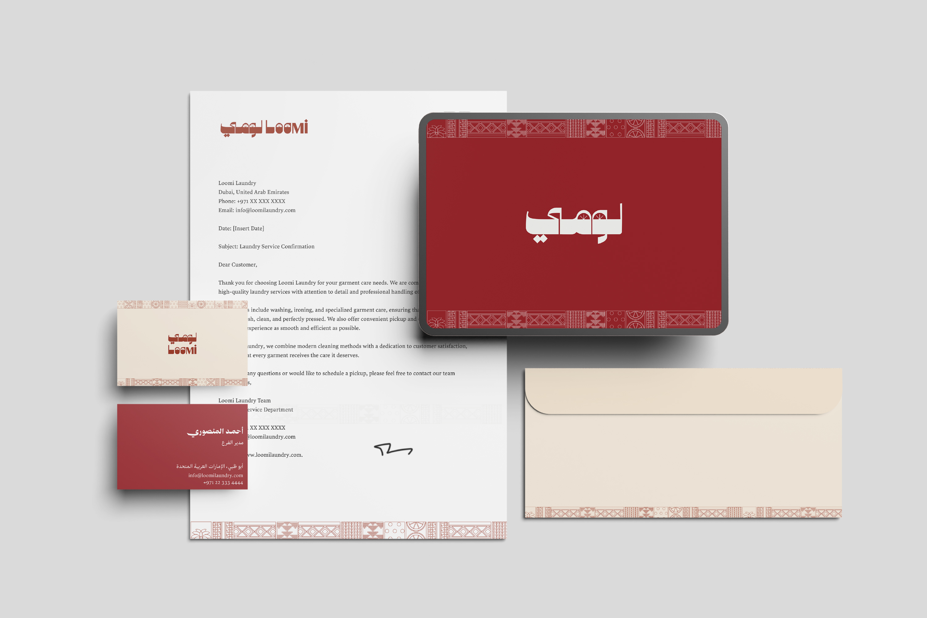
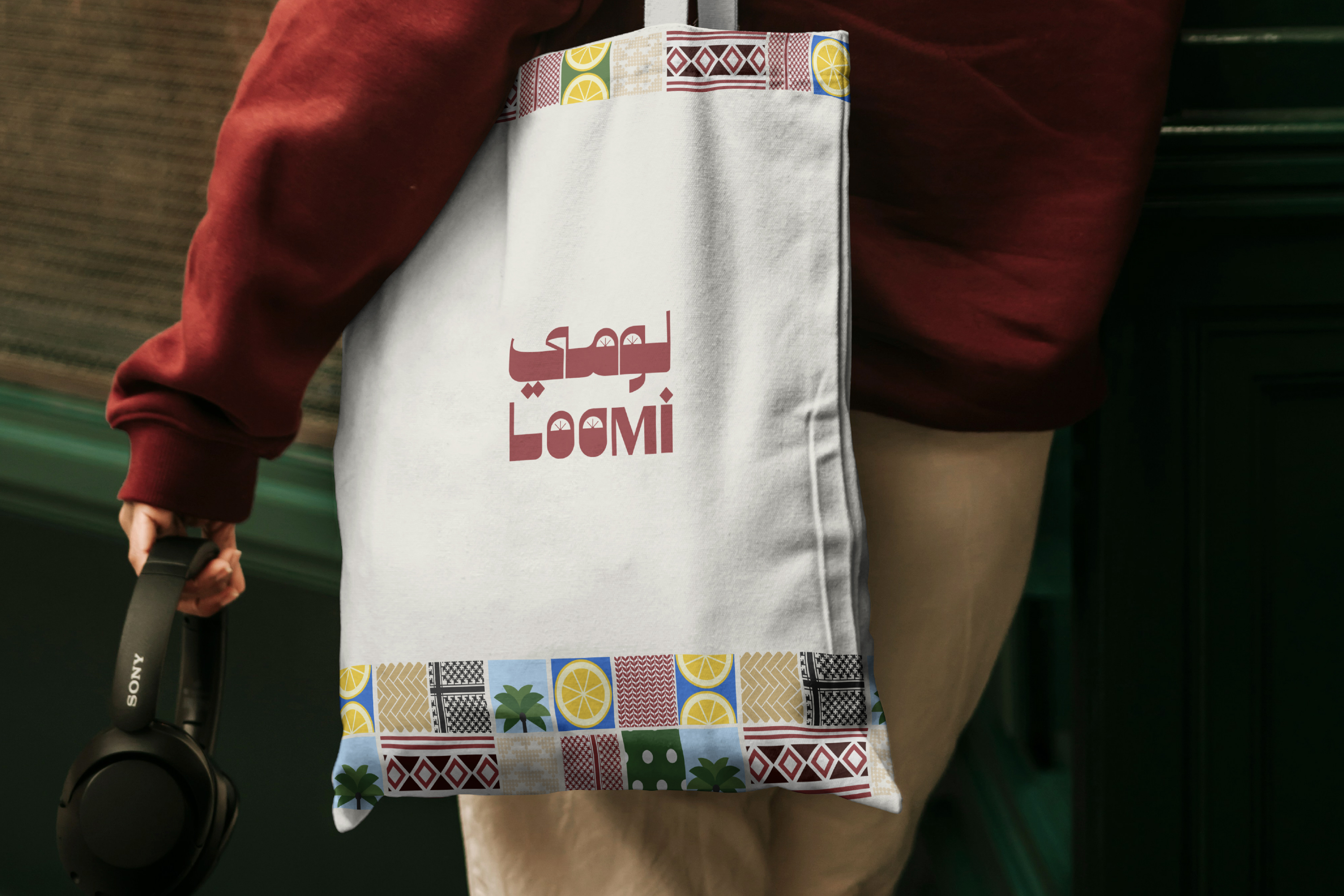
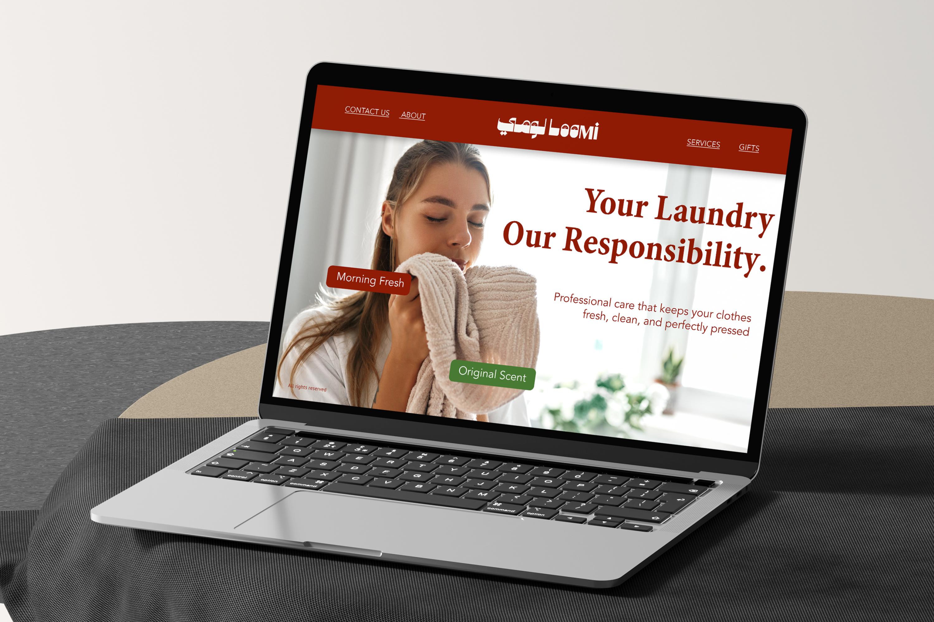
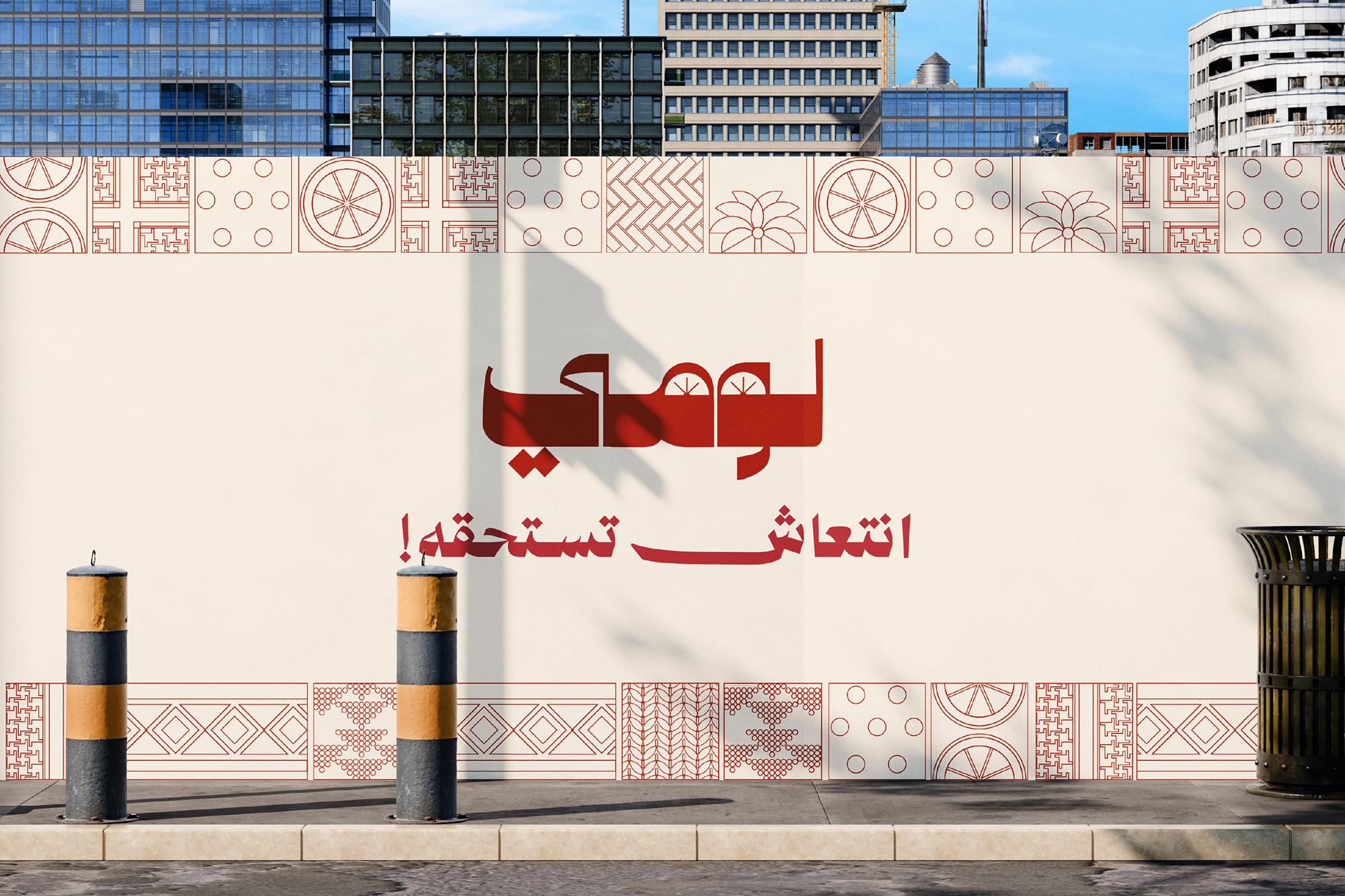
Heritage-Inspired Logo System: We developed a wordmark using a modern geometric NeoKufi display typeface, symbolizing the balance between tradition and contemporary design. The “Loomi slice” (dried lemon) motif was integrated into the letterforms to visually reinforce the brand name.
A Color Palette with a Story: The color story is inspired by the textures and landscapes of the UAE. “Loomi Green” represents nature and freshness, “Ghatra Red” pays homage to Emirati heritage, while “Desert Sand” and “Besht Black” tones add authenticity and a professional finish.
Harmonious Bilingual Typography: We implemented a system that ensures clarity and hierarchy. For Arabic titles, Zain provides a distinctive contemporary voice, while Minion Bold is used for English headlines to offer a strong, refined editorial presence.
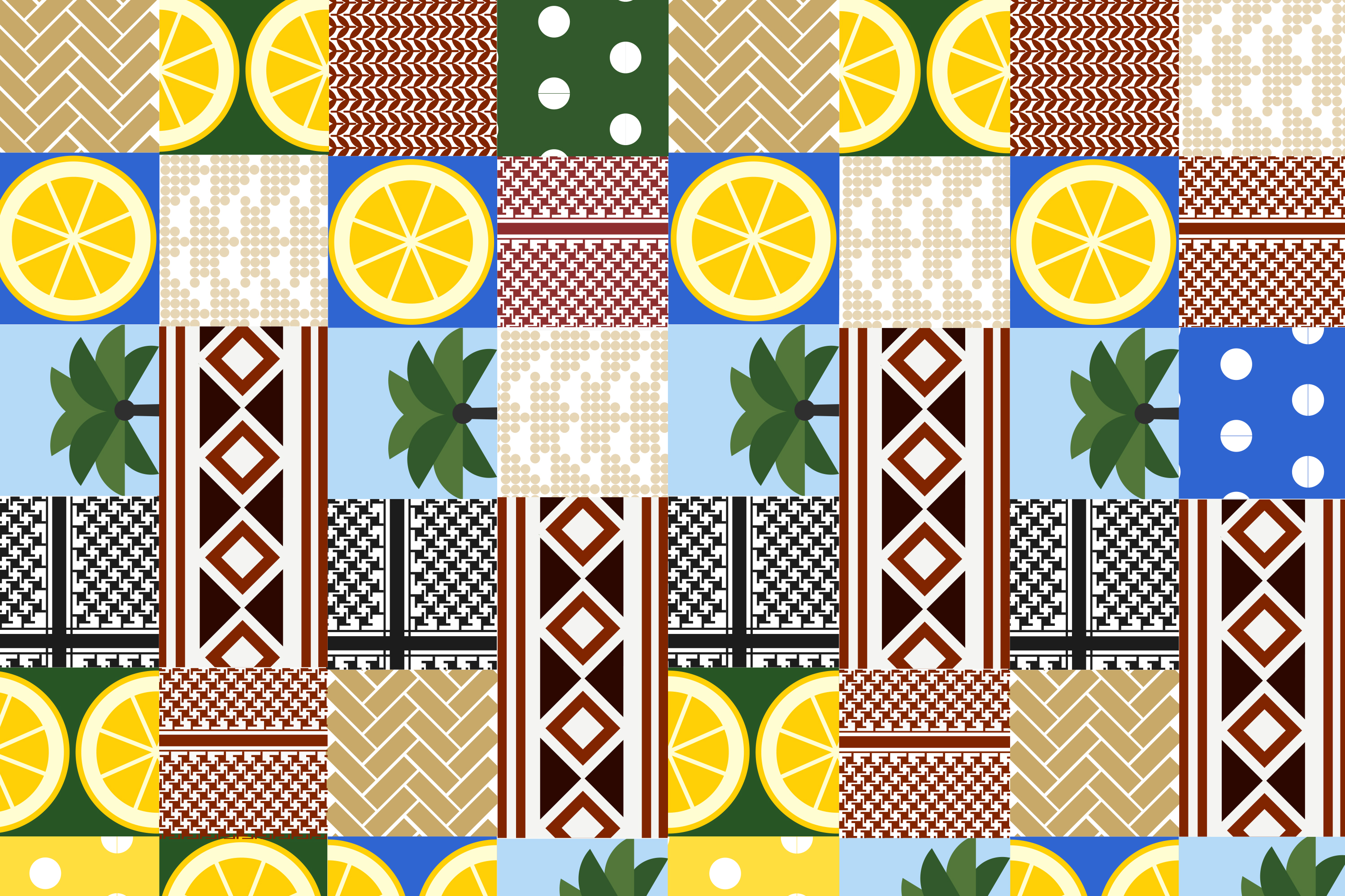
Visual Language & Patterning: We developed a pattern system inspired by traditional Emirati weaving, such as Sadu and Al Khos. These patterns act as cultural anchors across all brand applications, from packaging to digital content.